13.2. User interface description
The program looks like this by default: (Pic. 13.1.).
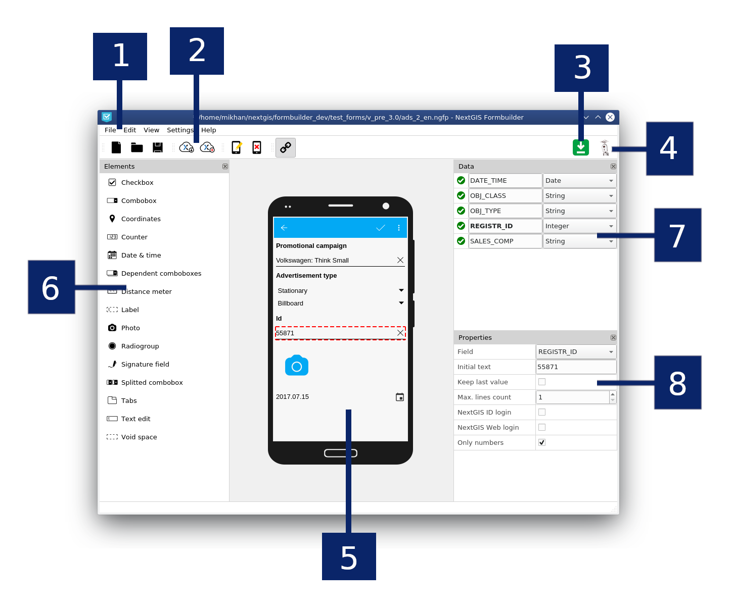
Pic. 13.1. Formbuilder’s GUI
Numbers show: 1 - main menu; 2 - main toolbar; 3 - “Updates available” icon; 4 - authorization button; 5 - “device” screen; 6 - “elements” menu; 7 - “Data” menu; 8 - “Properties” menu.
You can change the position, size and visibility of the side menus:
Hover your mouse cursor over the menu and press the left button to transfer it to a different place;
Pull the menu’s edges to change its width and height;
Press the close button to hide menu. You can make it visible again in the main menu section “view”.
13.2.2. Main toolbar
Contains fast-access buttons to subsections of the main menu. Move the mouse over the button to see its name (in a popup message) and description (in the program’s status bar below).
Note
Some toolbar buttons may be inaccessible, which is shown by a “lock” icon on the button. To get full access to all functions in the program: complete authorization, if subscribed you will gain access to a complete functionality.
13.2.3. “Updates available” icon
A green square icon with an arrow (the top right corner by default) will be shown only if updates are available (Windows and Mac OS only). If icon is not shown, then there are no updates, or the program failed to connect to the update server. Click on icon to update the program: Formbuidler will close (with a suggestion to save the project if there are changes) and update dialog will open. Follow the steps of the installation wizard. After the dialog finishes working, the program will restart automatically.
Alternatively, you can run the NextGIS update wizard as a separate program from the NextGIS installation directory.
13.2.4. Authorization
The button with the avatar image (the top right corner by default) allows you to sign in with NextGIS services and get the extended functionality of the program if you have a subscription. Press the button, then in the pop-up window press “Sign in”. In the opened browser page enter your email and password of your NextGIS ID, after that return to the program. Check that you have a “supported” account by clicking on the authorization button again. (How to create NextGIS ID account)
To log off press the authorization button once again and press “Sign out” in the pop-up window.
Note
Authorization needs to be completed only once. The next time you start the program, you will sign in automatically. Please note that after launching the program it may take several seconds before the blocked functionality becomes available.
If you want to log into another account, sign out both in the program and in the browser.
13.2.5. On-premise Authorization
If you want to login via the on-premise, you must specify the appropriate Endpoint in the authorization settings (Main menu -> Settings -> Authorization) (Pic. 13.2.).
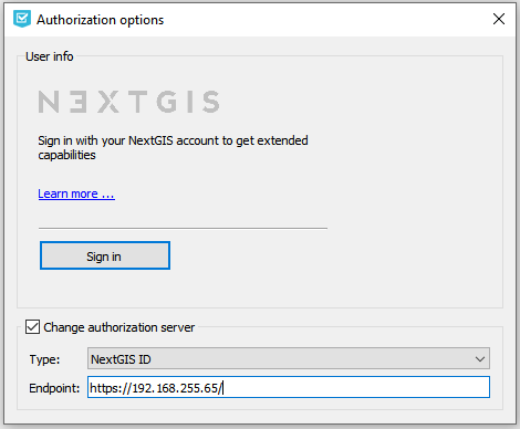
Pic. 13.2. Adding your own authorization server
13.2.6. Device screen
This is a screen layout of the real device on which data will be collected in NextGIS Mobile/Collector. It is designed to create a form: i.e. for placing, moving and grouping the elements of which the form consists and with the help of which the data about one object of the layer will be entered at the moment of data collection. elements in the form are arranged vertically, one after another. It is possible to group items by named tabs.
To add an element to the form - start dragging it with the cursor, while holding the left mouse button, from the “elements” menu (left by default) - the cursor will take the form of a squeezed hand. Alternatively, you can quickly add an element to the end of the form by clicking on it one time with the left mouse button, pressing the Ctrl key in the elements panel.
To select an element - click the left button on it once in the form. A red dotted frame will appear around the element.
To move an element - drag it by pressing the left button to any place on the form.
To delete an item, select it and press the Delete key on the keyboard. Deleting an item cannot be undone. Be aware of the fact that when you delete an element, the associated field(s) of the layer will also be deleted.
13.2.7. Form elements
This menu contains a list of all available elements that can be created on the form. Hover over an element to see tooltip with its description.
To add an element to a form drag it holding left mouse button onto the device screen in the middle (the pointer will look like a squeezed hand). Alternatively you can quickly add an element to the end of the form by left-click + Ctrl.
Note
Some elements may be inaccessible, which is shown by a “lock” icon on the button. To get access to the full functionality, log in and make sure you have a corresponding subscription plan.